
About Me
Hello! I'm Mia Hibler and I began my career as an educational facilitator, where I developed strong communication and problem-solving skills.Now, I’m transitioning into data analytics, utilizing tools such as SQL, Excel, and Tableau to discover insights and tell stories with data.I’m passionate about making data approachable and useful for decision-making.
Skills


Excel | Tableau | SQL | Google Sheets
Data Storytelling - 2+ years
Team Collaboration - 4+ years
Problem Solving - 2 + years
Communication & Reporting - 4+ years
Featured Projects
SQL | TABLEAU
Analyzing customer trends with postgreSQL
Analyzing student activity on a tutoring platform to guide efficient staffing allocations.


Tableau | Excel
Cleaning and analyzing school district data
Analyzing the relationship between chronic absenteeism and math proficiency across CCSD schools to identify students most in need of math support.
SQL | Matplotlib
Exploring and understanding iris species trends
This project analyzes Iris flower measurements to uncover species-specific patterns using SQL, Python, and a dynamic Tableau dashboard.


Google Sheets
Tracking Employee Attrition
This project analyzes employee attrition by retirement and termination, providing a dynamic dashboard to track goal attainment across departments.
Certifications

NCLab Data Analyst Career Training Program | Issued 2024

Google Data Analytics Professional | Issued 2025
SQL | TABLEAU
Analyzing customer trends with postgreSQL.
Project Goal & Background:
A tutoring center wants to allocate staff to efficiently minimize costs. Tutors for more advanced math courses are more expensive, so prioritizing staffing can reduce costs.Data Source : Tutoring Website Data - Kaggle (This data contains simulated student usage and subscription behaviors).Here are the questions I was interested in answering:
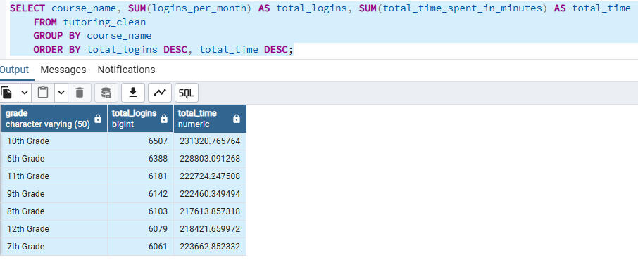
1) Which grades have the most activity?
2) What math courses are the most prevalent?I took the following steps to complete my analysis:
Full SQL queries used for data extraction and transformations can be viewed here.
1) Imported data into a PostgreSQL data base.
2) Created a temporary table with relevant columns.
3) Aggregated the data by grade and math course for insights.

Here are my key insights and takeaways:
1) Algebra 2 (mid-level) and Pre-Calculus (higher-level) are the most popular math courses, showing similarly high total logins.
2) 6th and 10th grades have the highest total student activity, with demand levels close to each other.
Recommendation:
The tutoring center should staff a balanced mix of mid and advanced level math tutors to ensure adequate student support while avoiding unnecessary costs from over-scheduling higher-level instructors.Skills Demonstrated:
SQL querying and data aggregation
PostgreSQL data management system to run queries
Translating insights into actionable recommendations
Tableau
Student Performance
Why I chose this project:
At the tutoring center where I work, potential customers commonly report that their kids are falling behind in school, particularly on standardized math tests. Students also often mention being chronically absent. I wanted to explore whether chronic absenteeism impacts math proficiency using public data from the
Nevada Report Card (CCSD)Data Cleaning Steps in Excel:
1) Imported data from a csv file and creating a duplicate dataset to manipulate.
2) Deleted all irrelevant columns.
3) Created a derived column to classify schools by level:
=IF(ISNUMBER(SEARCH(" ES",C2)),"Elementary",
IF(ISNUMBER(SEARCH(" MS",C2)),"Middle",
IF(ISNUMBER(SEARCH(" HS",C2)),"High",
"Other")))
4) Used the Filter from the data tab to delete blank or invalid rows.
5) Saved the cleaned csv file for Tableau visualizations.Here are my key takeaways:
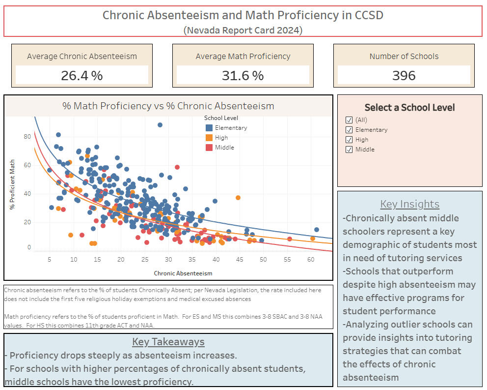
1) Schools with higher chronic absenteeism generally show lower math proficiency.
2) Middle schools have the lowest math proficiency at high levels of chronic absenteeism.
3) Some schools perform better than expected despite high absenteeism, suggesting additional factors influence outcomes.Actionable Insights:
Middle school students with high absenteeism show the lowest math proficiency, making them the most in need of tutoring. By focusing marketing efforts on this group, the center can attract more students, boost enrollment, and increase revenue.The dashboard is dynamic and adjusts based on what school level is selected. The full project can be viewed on my Tableau public profile here
SQL | Matplotlib
Exploring and understanding iris species trends

This project uses SQL for data validation and summary statistics, Python plotting libraries for visualization and modeling, and Tableau for interactive dashboards. This analysis reveals patterns across 3 species of Iris and the data can be found on Kaggle.Here are the questions I was interested in answering:
1) Which measurements are strongly correlated?
2) How do measurements vary by species?I took the following steps to complete my analysis:
The SQL and Python script used for data exploration write-up can be viewed here.1) Used SQL to clean data and compute summary statistics.
2) Created a dynamic Tableau dashboard for interactive exploration.
3) Generated boxplots, correlation heatmaps, and linear regression models in Python using pandas, seaborn, and matplotlib.Here are my key takeaways:
1) Petal length and sepal length show a moderately strong positive relationship for Versicolor and Virginica.
2) Due to species distinctness for petal and sepal length linear models, petal and sepal length could be used to predict species.Skilled used:
1) SQL querying and aggregation.
2) Python data analysis (pandas, seaborn, matplotlib, scikit-learn).
3) Data visualization and interpretation.The dashboard is dynamic and adjusts based on what is selected on the slicer. The full project can be viewed on my Tableau public profile here
Google Sheets
Employee attrition

This project explores employee attrition from a simulated employee attrition dataset for practice. This dashboard focuses on retirement and termination levels to assess whether corporate goals are being met.Company Goals:
1) Keep attrition by retirement under 10%
2) Keep attrition by retirement under 25% percent.Here are the questions I was interested in answering:
1) What percentage of attrition was by retirement?
2) What percentage of attrition was by termination?
3) Did the company meet the attrition goals?
4) What were the education level and frequency of buisness travel of the employees?I took the following steps to create my analysis:
1) Importing and cleaned the csv dataset.
2) Using pivot tables to aggregate key performance indicators KPIs.
3) Creating interactive drop-down slicers and synced tables together for filtering.
4) Created a bar and pie chart to visualize data.Here are my key takeaways:
1) The company met their goal of keeping the percentage of attrition due to retirement under 10%.
2) The company did not meet their goal of keeping the percentage of attrition due to termination under 25%.The dashboard is dynamic and updates charts based on department or attrition reason selected via the slicer. View the full dashboard here.